In Walter Isaacson’s biography of Steve Jobs, he wrote “Packaging can be theatre, it can create a story”, when referring to the beauty of an unboxing experience. Steve Jobs understood that a simple action like that could set the tone for a consumer’s relationship with a product. Similarly, the first glance of a product on a retail shelf, the tactility of it, and even the smell can create a lasting impression even before leaving the retail space (skincare brand Aesop’s retail consultants spritz a little of its deodorising spray onto their customers’ shopping bag before handing over their purchases).
While many brands choose to focus on the functionalities of the packaging – durability from storage, transportation, environment to retailers’ requirements – they may have unintentionally missed out a subtle yet crucial factor: that packaging also reflects the product. It is not uncommon for brands to see minimal success on new products the first time. More often than not, it is not the product itself, but its packaging that causes this. Erroneously, some brands have the notion that consumers make rational and informed choices prior to purchase, but most of the time it’s purely instinctive and reactive, which is why packaging design becomes key when a consumer makes the final decision whether to purchase or not.
The concept of packaging is not a recent practice, in fact, most historians agree that the first packaging was invented when early humans were nomadic hunters and gatherers. The nature of their nomadic lifestyles forced them to construct devices for carrying and containing their belongings. The very first form of packaging involved the use of leaves, nuts, gourds, animal skin, and wood. As humans evolved from hunter-gatherers to domesticated villagers, their version of packaging also advanced to woven sacks and baskets, wooden boxes, and clay containers. The rise of cities and trading thousands of years ago brought about the exchange of goods and innovations, creating a new form of packaging – the use of blown glass (molded glass of various shapes) and wooden barrels. In the 1800s, metallurgist and inventor Alexander Parkes created the first man-made plastic, Parkesine, which later changed the world of packaging.
Today, packaging has grown from mere practicality to clever, thoughtful, and beautiful designs that help differentiate one brand from another. Good product packaging not only weaves a story with the brand’s values, it also intrigues and helps consumers identify the brand in a competitive market. Like these five, for example.
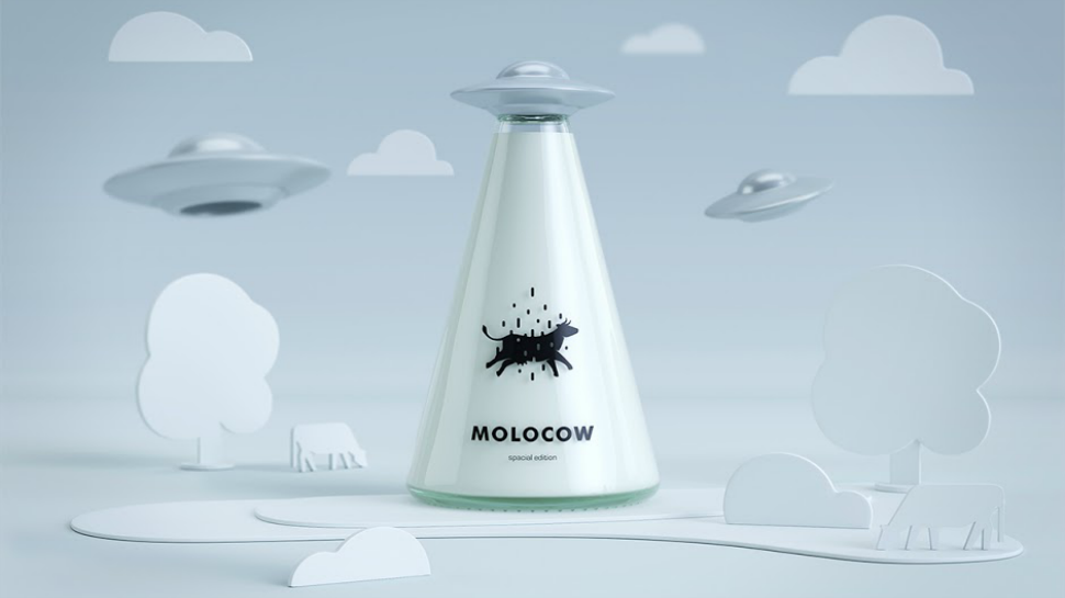
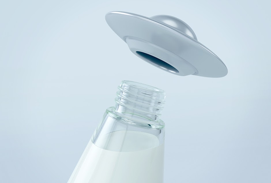
Forget the ubiquitous milk cartons, because the team at Imedia Creative Bureau has created the ‘spatial edition’ milk bottles inspired by the story of alien bovine abductions for the Molocow milk company. Based in Kyrgyzstan, the agency has reimagined the milk bottle design and created something ‘out of this world’ that’s appealing to children and adults alike. From its UFO screw top to its beam-shaped glass bottle, this design is a refreshing take that might even cultivate the good habit of drinking milk.
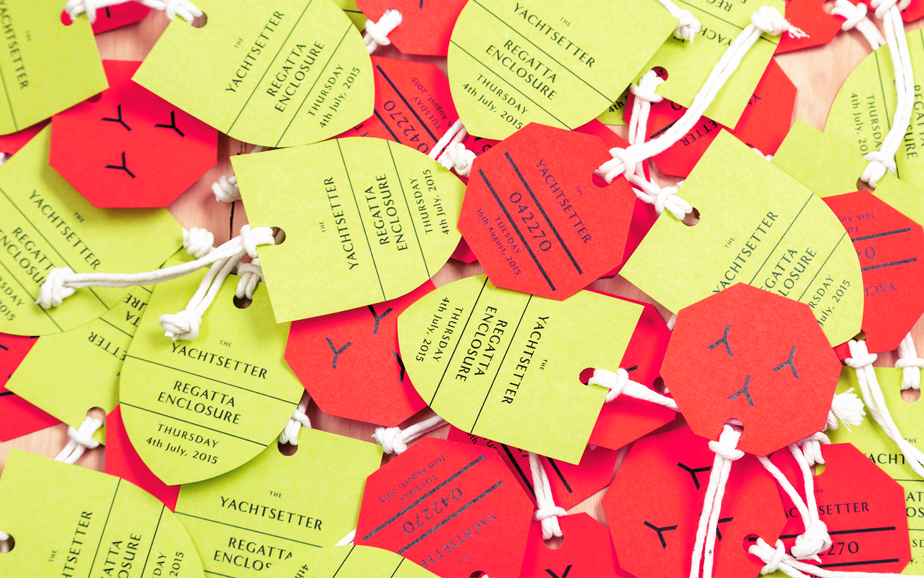
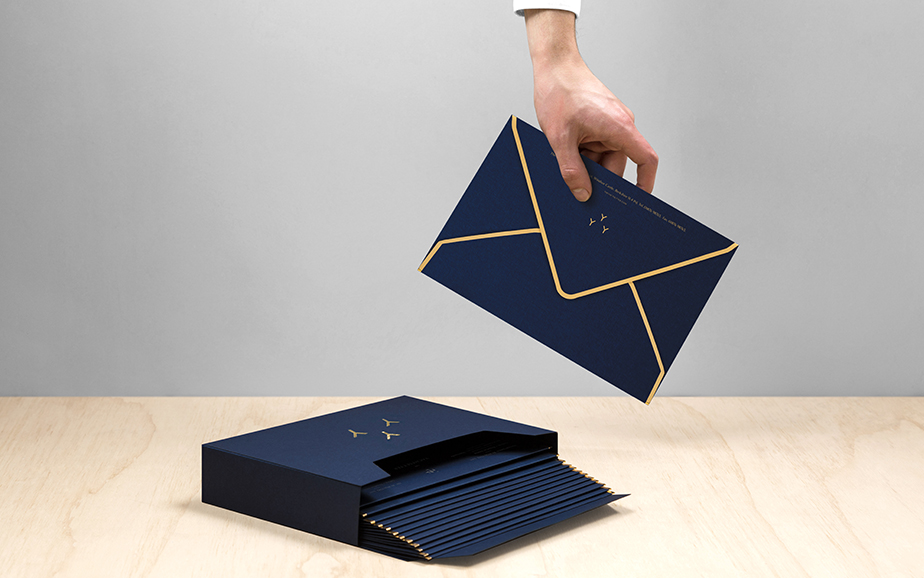
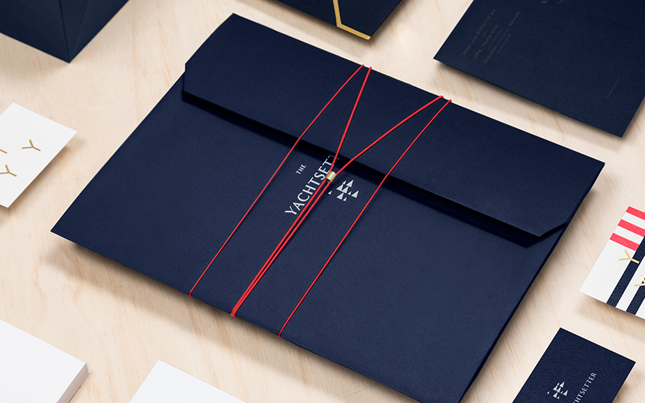
Packaging design for a service is vastly different from that of perishable goods. The Yachtsetter, a company that provides yacht and cabin rental services for weekend vacation tours, has engaged Mexican branding company Anagrama to design a unique experience for its customers. Drawing inspirations from the nautical language and regattas, the agency delivered a series of beautifully designed brand collaterals that captured the essence of sailing. The results? Branding The Yachtsetter as an exclusive service encapsulating luxury, entertainment, and comfort.
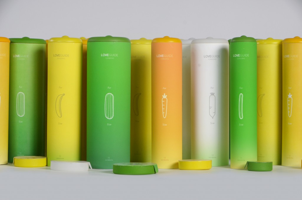
Love Guide Condoms
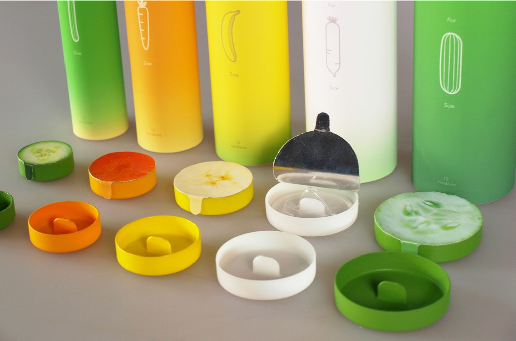
Designer Guan-Hao Pan may have helped solve the conundrum faced by millions of men around the world – properly identifying the size of a condom. He has designed a new packaging system indicating the sizes of the penis girth comparable to specific fruits and vegetables. Whether it resembles a cucumber, carrot, turnip, banana, or zucchini, the easy reference means a proper condom fitting, thus decreasing breakage due to wrong size selection, and eventually reducing the risk of unwanted pregnancy and sexually-transmitted diseases.
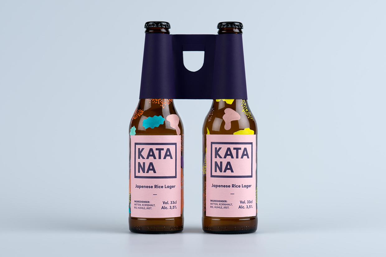
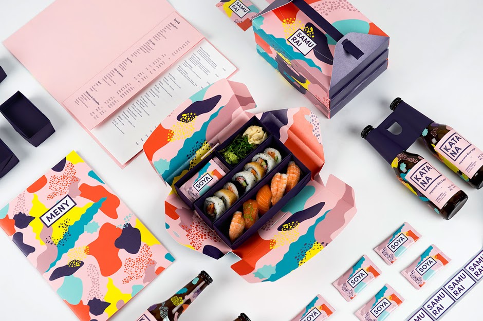
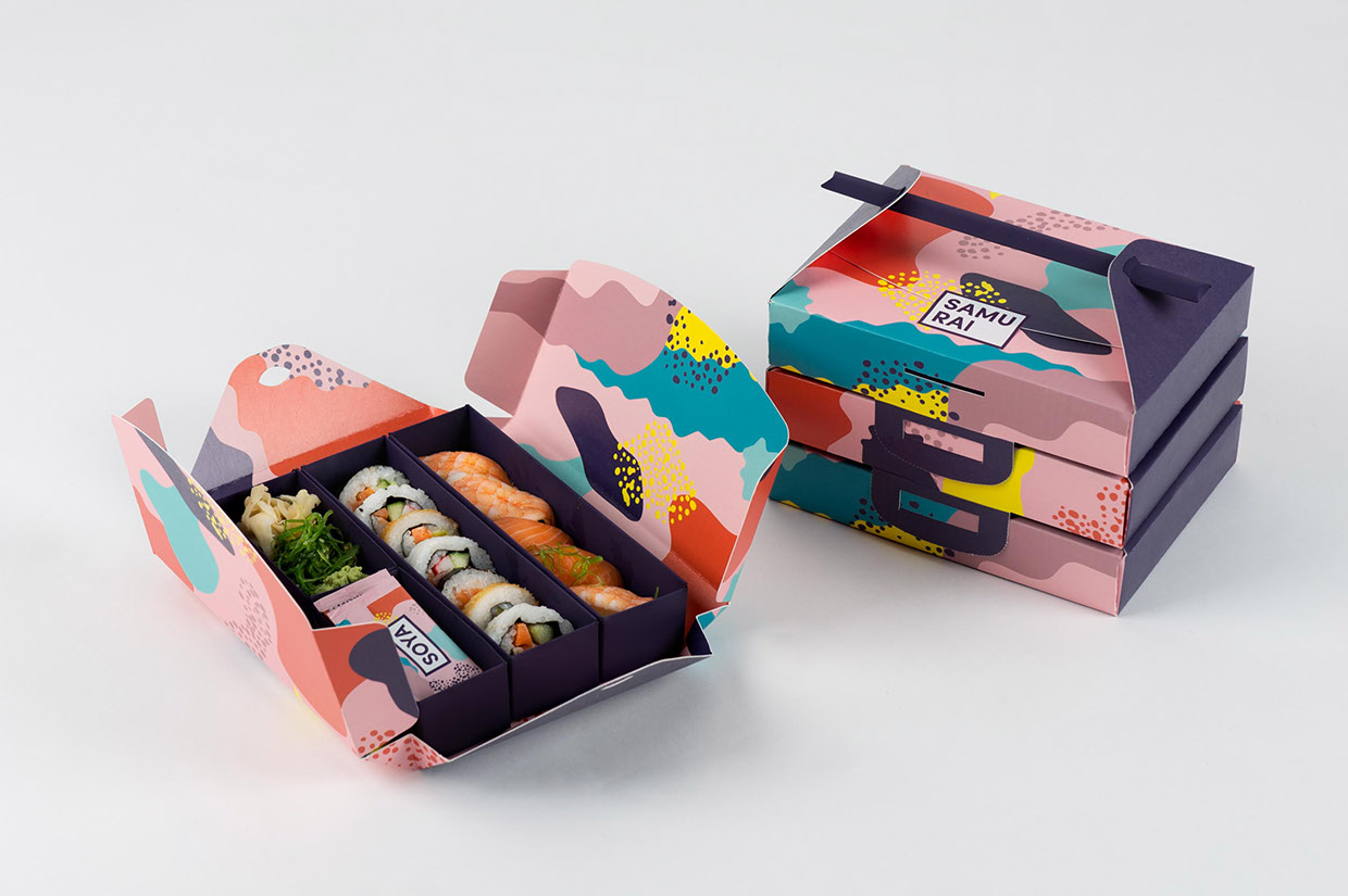
A group of Swedish students came together to give Samurai, a Japanese restaurant located in Stockholm, Sweden, a completely new look. Incorporating the vibrancy of Japanese culture and delicate handwork together with carefully thought out colours and patterns, they’ve created playful and eye-catching designs consistent throughout its range of products. Now it not only makes the food look tastier, but is also a thoughtfully designed package that’s perfect for takeaways.
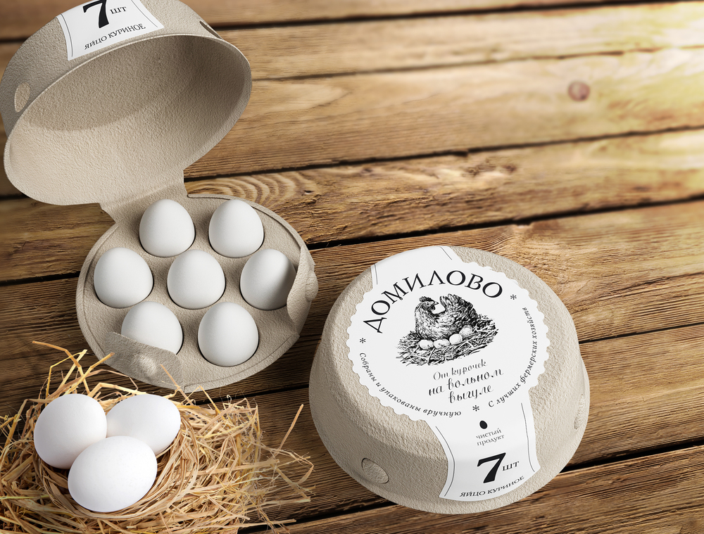
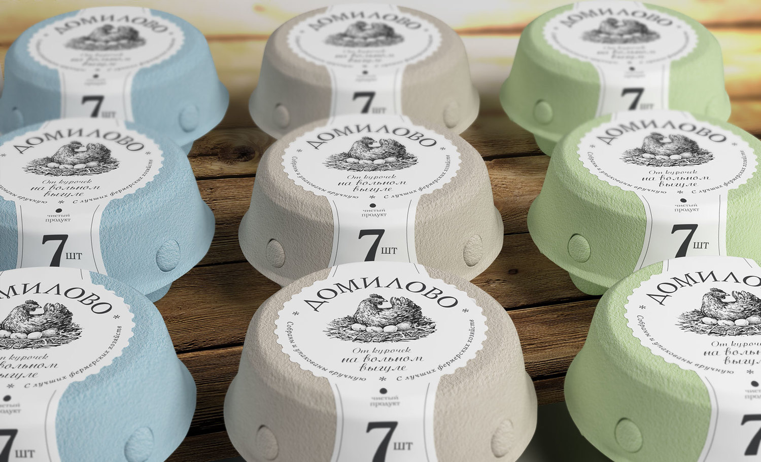
How does a farm tell the world that its produce is so fresh, it’s like bringing a piece of the farm life home with you? Russian branding agency Getbrand may just have the answer. They’ve redesigned the packaging with a deep understanding on the nature of the business. Inspired by a henroost, the packaging, made of eco-friendly densely pressed cardboard, emulates a nest. Contrary to a typical egg container, this new design evokes an emotional connection through its shape, texture, and the ‘warmth of a home nestled by a mother hen’.
